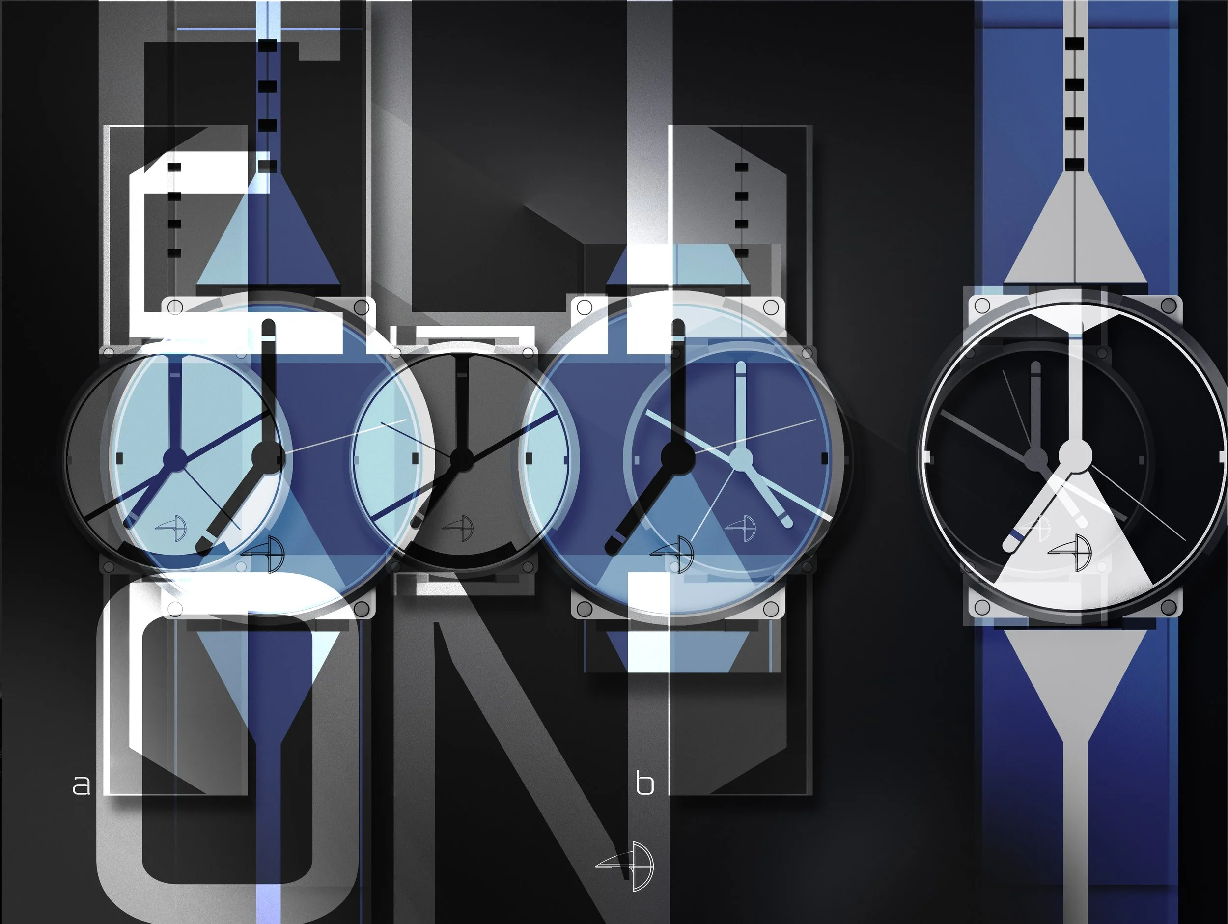
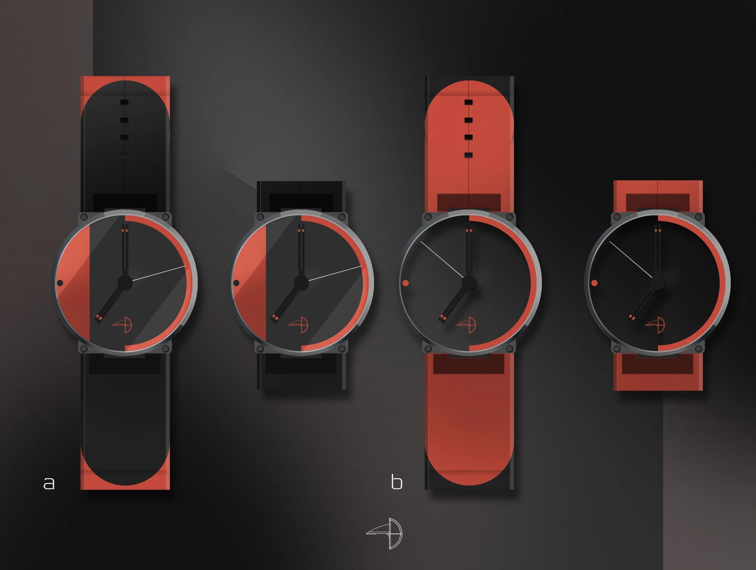
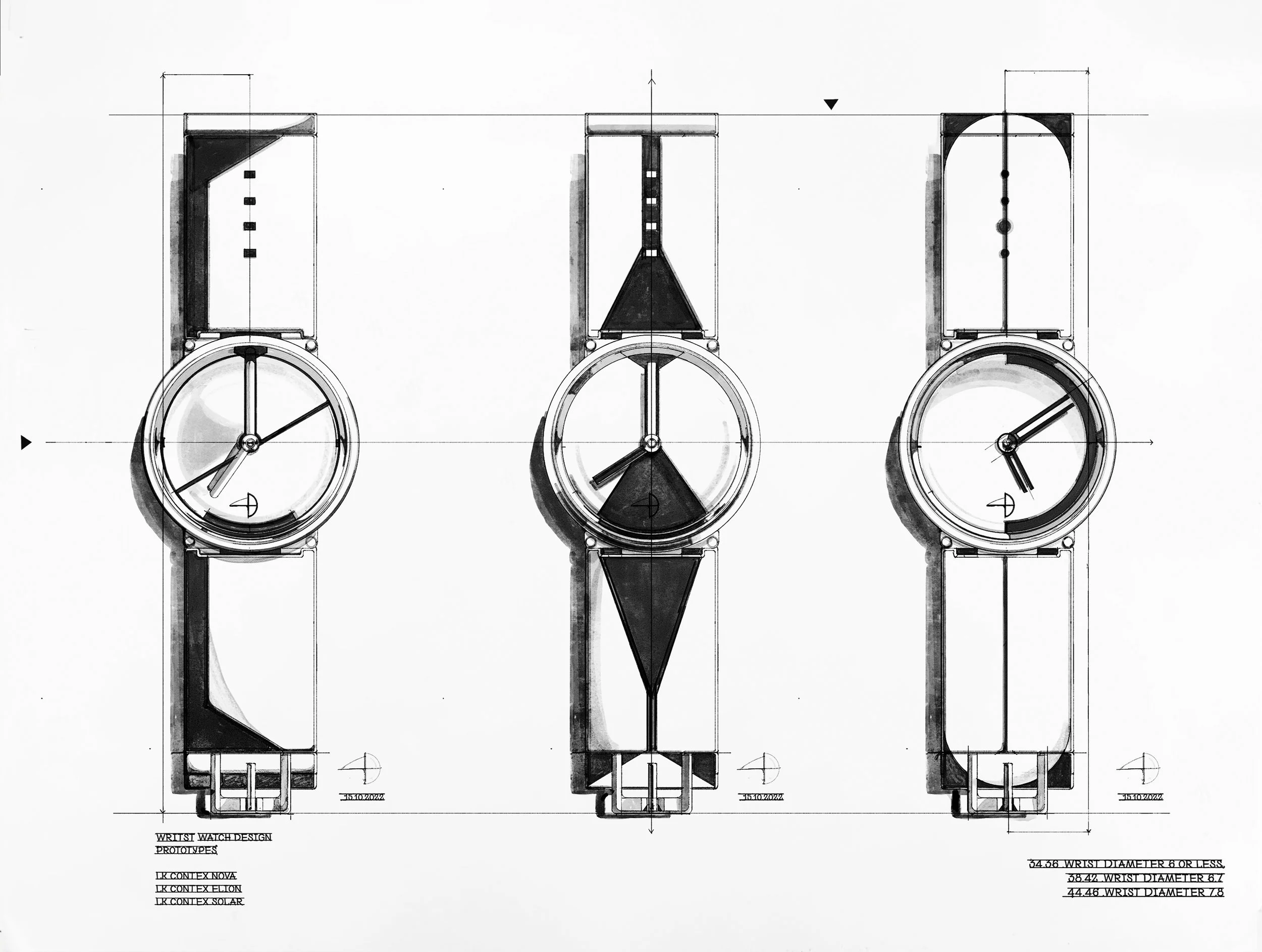
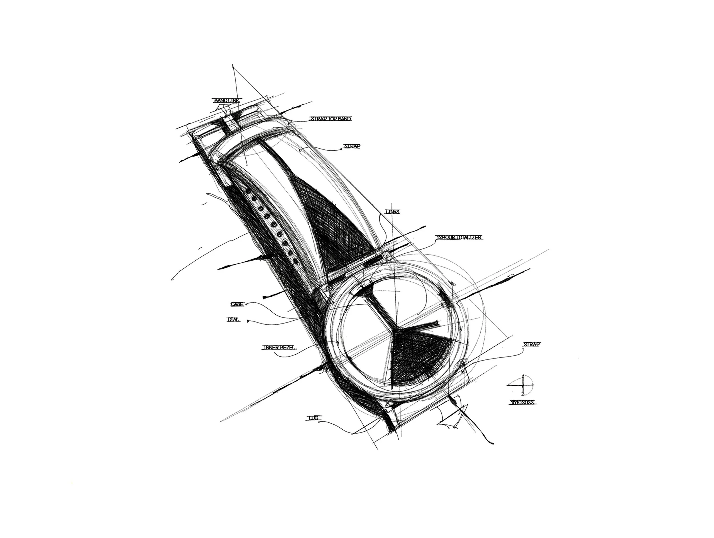
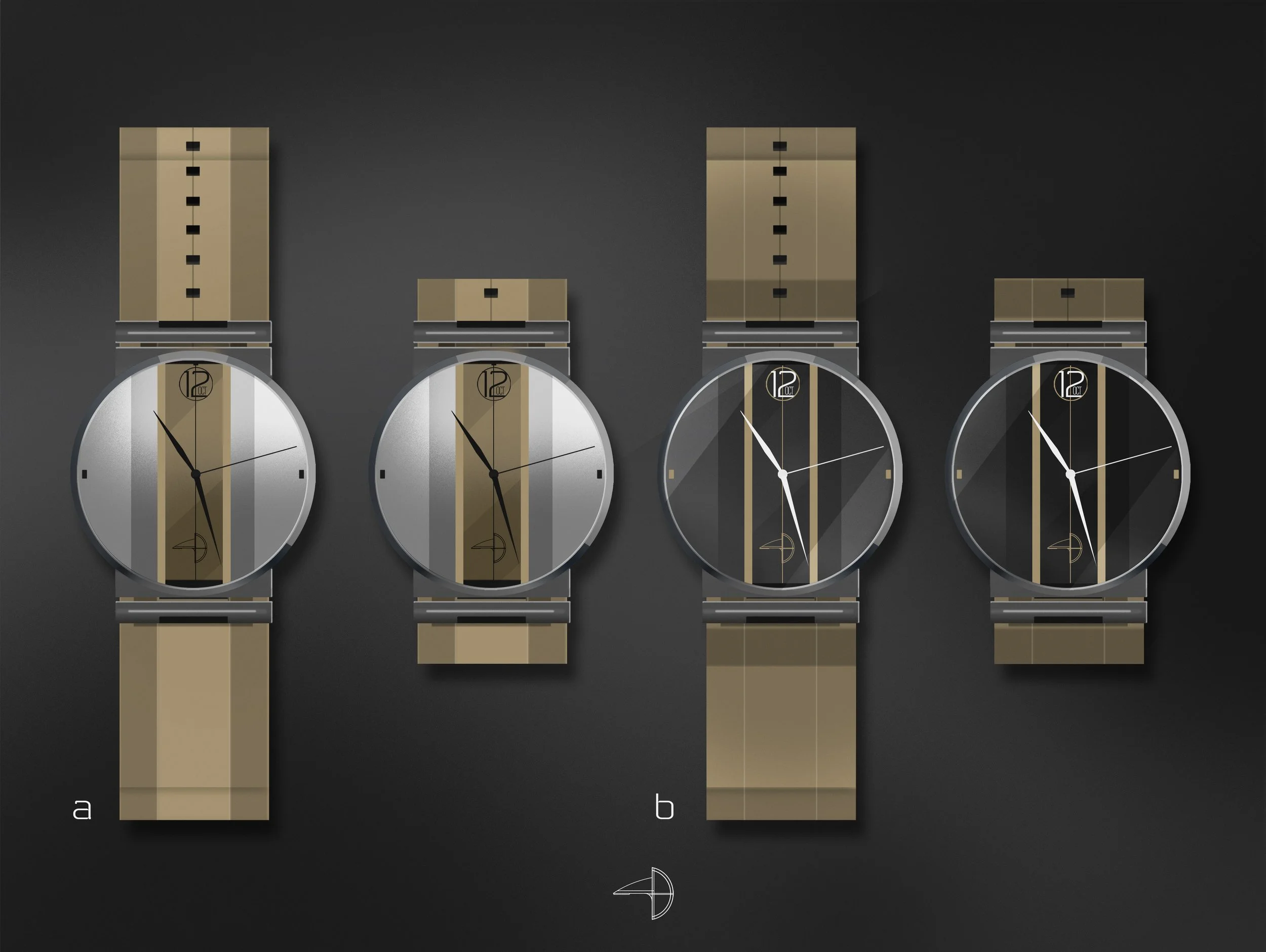
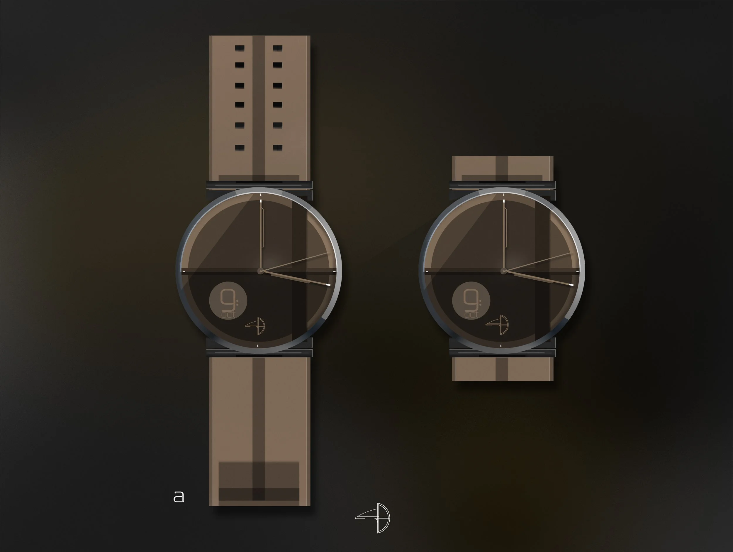
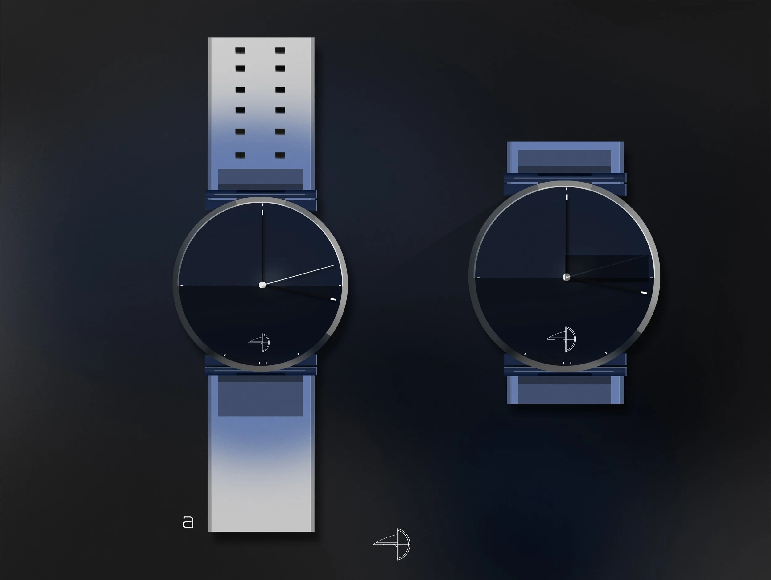
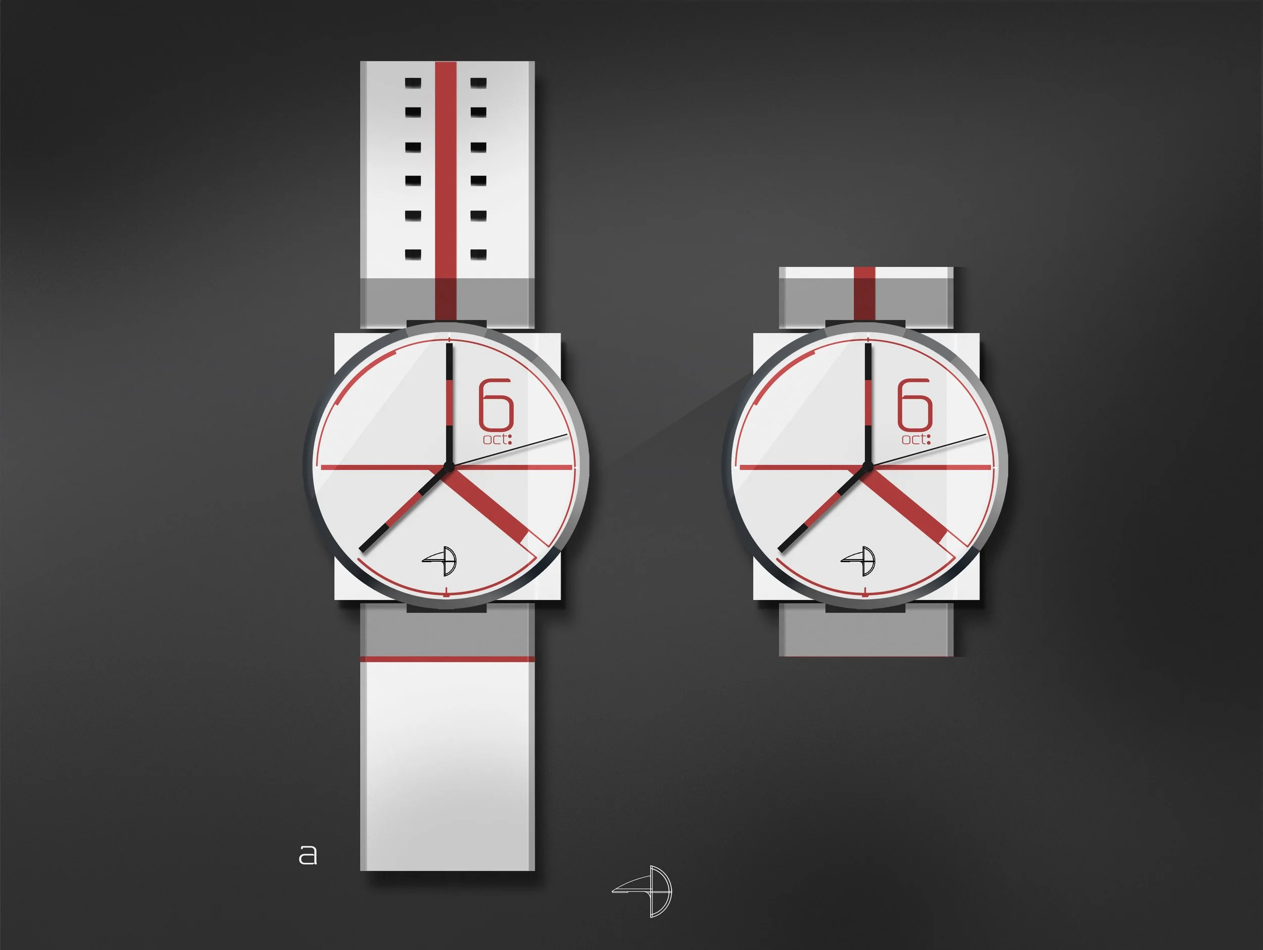
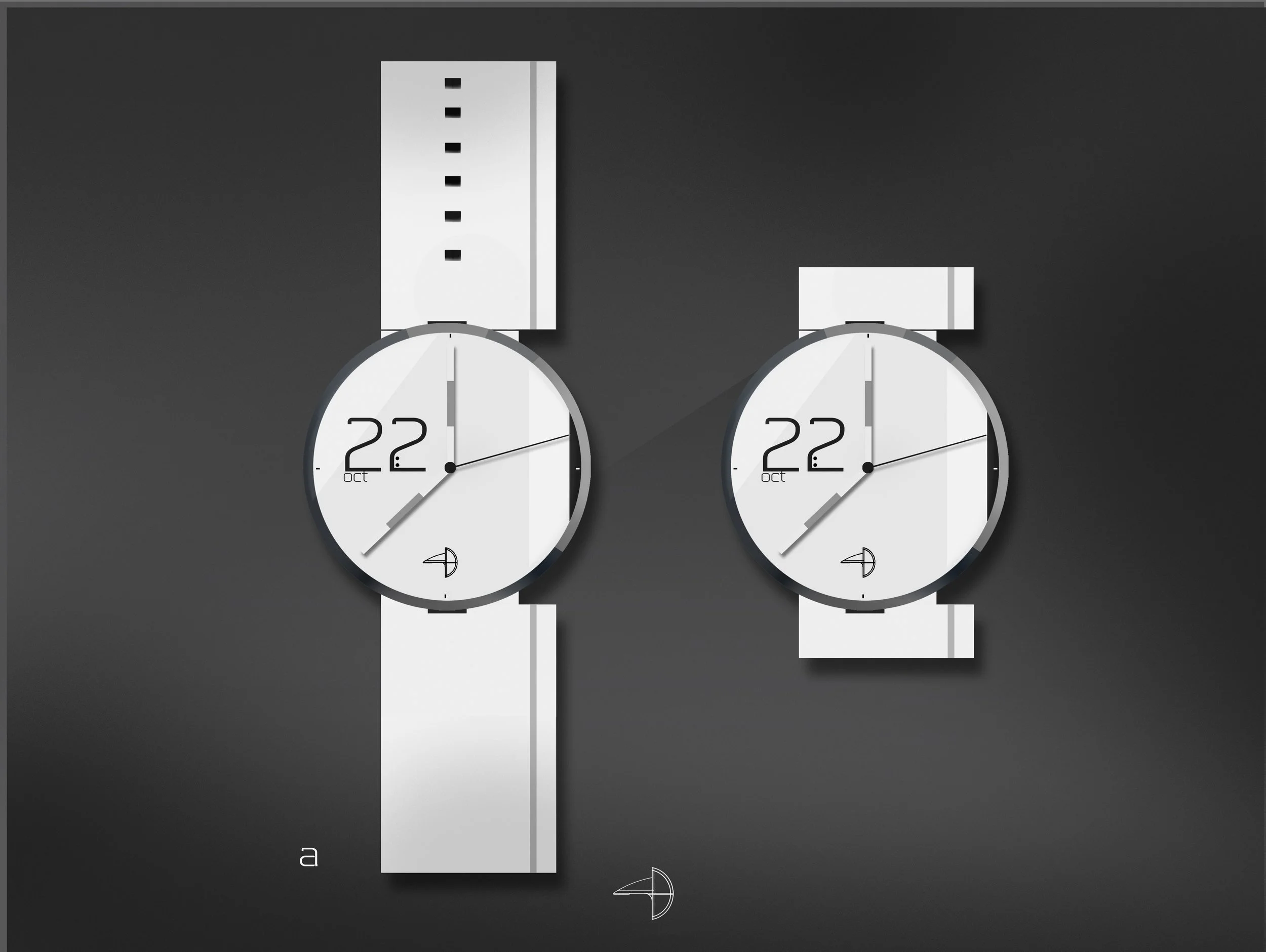
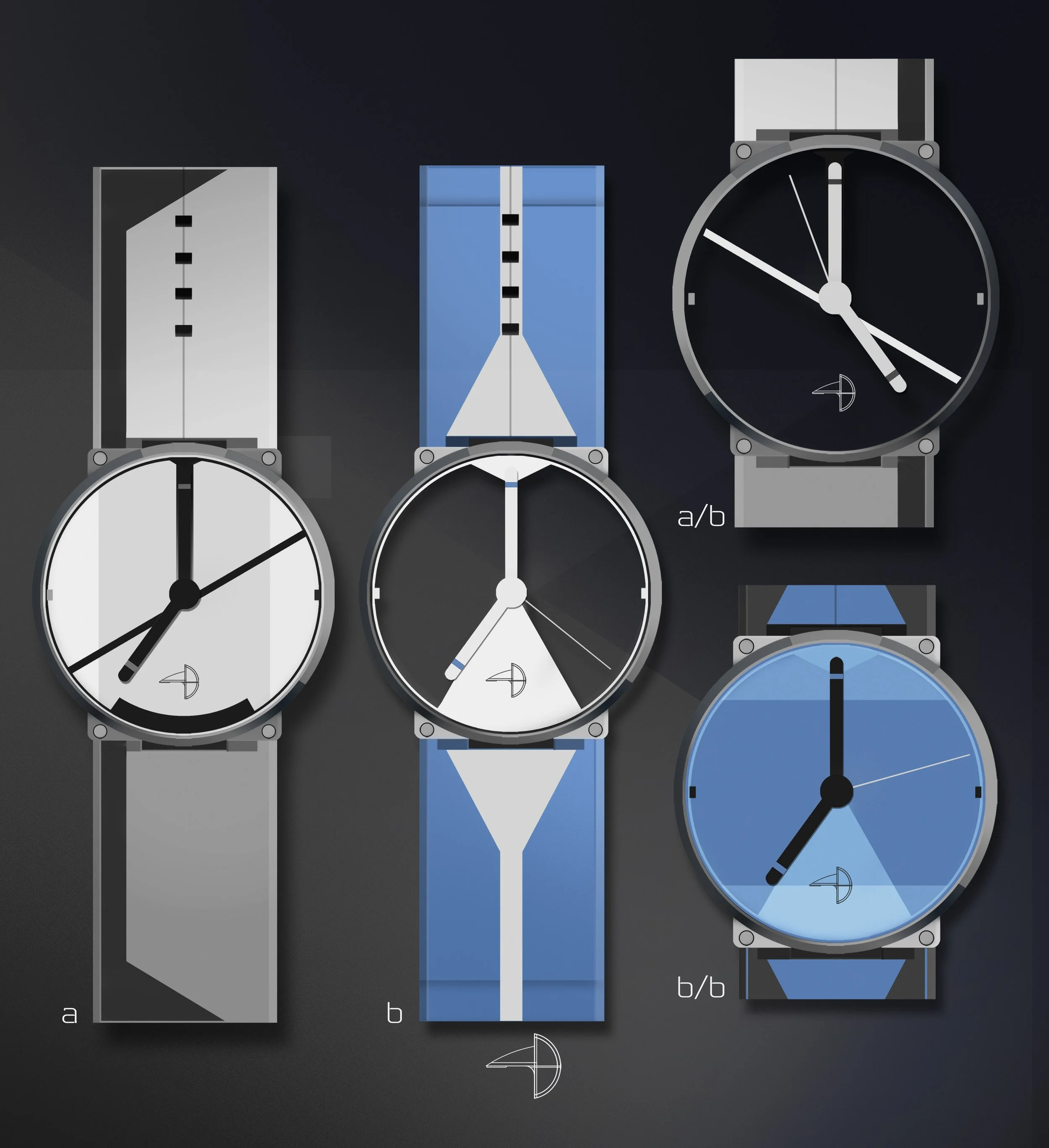
Watches are where I test ideas that are too precise for vehicle work. The series explores a single case architecture across multiple dial and strap languages — square lug geometry meeting circular case, the tension between those two forms doing most of the design work. The strap is treated as a graphic element, not hardware. Dot perforations, color blocking, vertical stripe inlays — each variant changes the read completely while the underlying object stays resolved. The blue series pushed transparency and layering. The red goes flat and confrontational. The tan variants bring the language closest to something wearable without losing the concept integrity. The original sketches show where the triangle dial motif came from — a deliberate non-traditional index that makes you read the time differently.